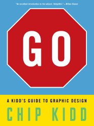
 Go
GoA Kidd's Guide to Graphic Design
Review posted May 26, 2014.
Workman Publishing, New York, 2013. 150 pages.
Starred Review
Go: A Kidd’s Guide to Graphic Design is a wonderfully visual introduction to all that goes into graphic design. Chip Kidd takes the approach that everyone is a designer, and he teaches the reader to be more conscious of design decisions, along with the effects they have.
He begins with an overview of design in general and graphic design in particular. He goes on to look at specific elements of graphic design: Form, Typography, Content, and Concept. Each element is looked at in great detail, and with lots of examples for each aspect. For example, under Form, he looks at things like Scale, Image Quality, Symmetry/Asymmetry, and Color Theory, to name just a few. Absolutely every concept has an example. There are no pages in this book consisting only of plain type.
Many of Chip Kidd’s book cover designs are featured in the book, showing that he really does this professionally, and giving examples of what works and the rationale behind them. But those are by no means the only examples.
The book finishes with 10 Design Projects for kids to try on their own, thus giving them a way to use the concepts they’ve learned. What’s more, he asks them to send copies of their projects to his website, gothebook.com, so not only are they encouraged to be creative, they get ideas for how to be creative, and they get to show off their creativity.
