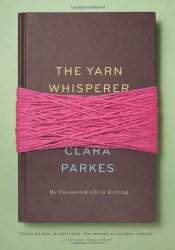
 The Yarn Whisperer
My Unexpected Life in Knitting
by Clara Parkes
STC Craft, a Melanie Falick Book (Abrams), New York, 2013. 160 pages.
Starred Review
This book would be an ideal gift for any knitter who also enjoys musings about life (like me). Clara Parkes takes experiences and techniques from her life in knitting, and applies the ideas to life.
For example, she talks about how a steek is like a divorce or other big cuts of life.
There’s a way to do it right, without pain. We work a series of steps called a steek, so that the stitches are prepared for what’s coming and can absorb the shock, heal without any scars, and even thrive in their new environment.
Another chapter is called “Stitch Traffic,” and talks about how stitches travel:
But some patterns do wild things. When you move those stacked stitches around, split them up and swap them over and under one another, force sudden merges and yields, driving becomes much more interesting. Your roads sprout new lanes, fork off in different directions, pass through busy rotaries. They can be detoured by giant bobble boulders, blasted with yarnover potholes, or forced into sudden dead ends….
Cables are the knitter’s version of highway overpasses and tunnels guiding lanes of stitches on their merry way…. Wide cables are like L. A. freeways, their beautiful maze of overpasses and off-ramps leading every stitch home. Occasionally traffic will snarl from a jackknifed big-rig, a mis-twisted cable. You’ll send in a wrecker to unravel the whole thing – or maybe use the Jaws of Life to cut an outside strand and reknit your way back in.
Her chapter on the Kitchener stitch and seamless connecting of all kinds begins by telling about the Knitter’s Handshake:
Two hands go in for the grab-and-shake, but at the last minute, they veer to the closest sleeve or band and grab it instead, while we ask, “Did you knit this?” Our eyes immediately scan the fabric for seams and joins, cast-on edges and edgings. We can’t help it, we’re wired to look for imperfections. A proper seam garners respect and admiration, even envy. Hastily worked, jagged, or lumpy lines are like scars – we know it’s impolite to ask how they got there, but we can’t stop staring.
I like “The Dropped Stitch” chapter so much, I’m going to quote from it at length:
Yarns are like people. Some have abandonment issues. They don’t do well when stood up. They look at the empty chair. They check their watches and realize what’s happened, and they panic. Glancing around, they see happily secure stitches just out of grasp, mocking, sneering, like teenagers in a cafeteria. They look up for the reassuring arms of the next row, but they see only air….
But not all yarns respond in this way. Some stand their ground, not the least bit unnerved by their disconnection or solitude. Their stitches can sit suspended for hours, days, years even. They bring their own books. They write letters home. They nod to passersby, reach out to pet strangers’ dogs, completely confident that eventually someone will notice their absence and come back to pick them up. “Oh, hello there,” they finally greet the returning needle, sliding in quickly and putting on their seat belt. “Nice to see you again.”
What makes a yarn react to abandonment the way it does? Why do some people crumble when faced with that empty chair, while others take it in stride? Does it all boil down to confidence – spunk, determination, security in one’s self and one’s own place in the world? Ironically, the most opulent and imperial yarns – the ones with slick and glossy surfaces that glide past their neighbors without so much as a how-do-you-do – tend to slink out the emergency exit the fastest.
Whether it’s from vanity or perhaps shyness, these slippery silks and smooth worsteds seem to have fewer deep and abiding connections. They look so beautiful in the skein. Their smooth and dense construction may help them last longer in the world. But what kind of life do they have? They’re so intent on holding it together that they rarely relax, let their hair down a little, get to know their neighbors. They sit upright in their fabric, arms held in to preserve their personal space. Knit them too loosely and sunlight will stream in between each stitch; too tight, and the stitches will quickly get grumpy and stiff from the forced intimacy. They expect life to go a certain way….
But those yarns with outgoing personalities – the ones formed from a noisy and jubilant community of lofty, crimpy fibers that are always in one another’s business – those yarns come together in times of trouble. Each stitch, even the tormented teenager who just wants a little privacy now and then, fundamentally supports the others. They willingly expand and contract to fill whatever space you give them. Need to add three more place settings for dinner? No problem, they smile, we can stretch the meal. And when the needle suddenly disappears and leaves a stitch stranded, the others reach out instinctively, “We’ve got your back,” they say, and they mean it….
Depending on where you go, these rugged-seeming woolen-spun yarns may not be sitting at the popular kids’ table. In fact, they’re more likely to be sitting in smaller groups outside, on the grass, under a quiet tree. But you know what? When push comes to shove comes to slipped needle and dangling stitch, when a chair is empty that’s supposed to have someone sitting in it, those are the yarns that will always wait for you. They are loyal to a fault, forgiving and secure in their own twist and tenacity. You want them on your side.
She talks about how yarn stashes are like gardens, casting on represents beginnings, and swatching is “the knitter’s equivalent of sight-reading.” There are all sorts of connections to knitting from the mind of someone who loves knitting and loves life.
I read it a chapter per day, and consistently got things to smile about and some food for thought. All lovers of yarn will find something to love about this book.
knittersreview.com
claraswindow.blogspot.com
Buy from Amazon.com
Find this review on Sonderbooks at: www.sonderbooks.com/Nonfiction/yarn_whisperer.html
Disclosure: I am an Amazon Affiliate, and will earn a small percentage if you order a book on Amazon after clicking through from my site.
Source: This review is based on a library book from Fairfax County Public Library.
Disclaimer: I am a professional librarian, but I maintain my website and blogs on my own time. The views expressed are solely my own, and in no way represent the official views of my employer or of any committee or group of which I am part.
