I’ve made a Normal Distribution Coloring Sheet and posted it in my Mathematical Knitting Gallery, Sonderknitting.
I thought it would be fun to talk more about it and show some examples.
The reason it’s in my Mathematical Knitting Gallery is that the idea began with knitting.
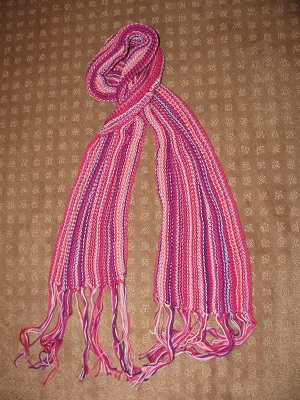
First, it was my Probability Scarf. I read this idea somewhere. Just choose six colors that look good together. Knit the scarf lengthwise. Assign the numbers 1 through 6 to the six colors. For each row, roll a die to decide which color to use on that row. Flip a coin to decide whether to knit or purl.
Here’s how that scarf came out:
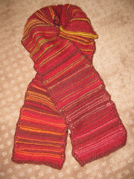
But in this scarf, all the colors are equally likely. This is called a uniform distribution. What if the colors were chosen from a normal distribution, a bell-shaped curve? That’s what I did with Jade’s Outliers Scarf, using bright colors for the outliers, plainer colors for the middle of the curve.
But then I thought it would be fun — and much, much quicker — to do this with colored pencils or crayons. So I made a coloring sheet that is just a grid. But the instructions explain how to use random numbers chosen from a normal distribution to color the sections in the grid.
The scarf used three colors, plus a rainbow yarn for the outliers. I decided to use four shades of colored pencils: dark blue for within half a standard deviation of the mean, dark purple for between one-half and one standard deviation, green for one to one and a half standard deviations, and light blue for one and a half to two standard deviations from the mean. Then I used a red marker for the outliers more than 2 standard deviations out from the mean. (I may try this in a scarf, so it was nice to check how it looks first.)
Here’s how it turned out:
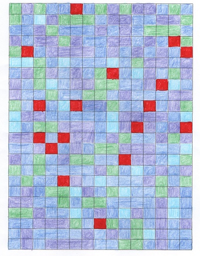
Since a lot of characteristics in people or in nature have a normal distribution, this gives a good feel for how people vary. It also explains why the outliers might feel like oddballs. And why one outlier might have a hard time finding another like themselves. But don’t change, outliers! You are what makes life beautiful!
I’m still going to try some other color schemes. I’m thinking it might be time to buy some colored pencils with more shades.
But meanwhile, it occurred to me that I could get more shades if I used computer coloring.
My grid is a table in Microsoft Word. And you have the option of coloring each cell, specifying a number between 0 and 255 for the red, green, and blue elements in RGB mode.
So I went back to random.org and generated numbers from a normal distribution with 128 (right in the middle) as the mean and 42 as the standard deviation. So the only way the numbers would go past 0 or 255 would be more than 3 standard deviations out from the mean. (With 990 numbers generated, only one did.) I’m thinking about doing it again using a standard deviation of 64, in which case there would be more variation, and you’d have more using 0 or 255.
It was interesting to do. The majority turned out to be grayish. You’d get the brightest squares when one element was very different from the other two.
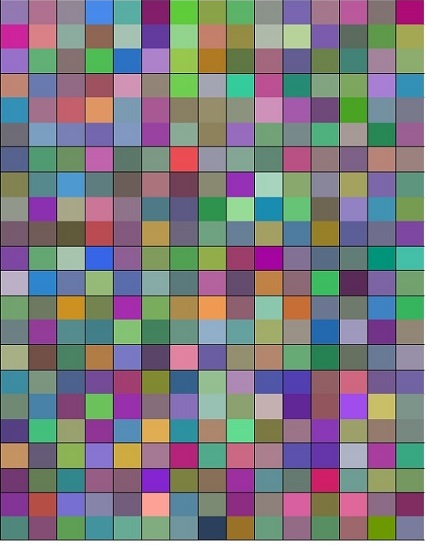
It took a long time — I’m sure it would be fairly simple to create a program that would generate one of these charts, so maybe I’ll do that sometime in the future. I’m also thinking about doing the same thing but using the HSL color model available in Word. HSL stands for Hue, Saturation, and Lightness — but it also uses numbers 0 to 255 for each one.
Meanwhile, I feel like my intuitive grasp of the normal distribution has grown.
But mostly, I think these are pretty.